A New Design: Part 1
Careful! This post is looking a little old and could be inaccurate in many, many ways
Recently I’ve been searching for ways to improve as a designer and obtaining a little more feedback on what I do from others in the community should definitely help. For most client work it’s not possible to get feedback like this early in the design phase but a project I’m doing for a friend seemed like a good opportunity to try something out.
Below is an early stage of a design I’ve been working on and essentially I’m going to describe a bit of the thinking behind the design and hopefully get some feedback to help make it even better.
Design #1
Bit of Background
Doug, whose site this will hopefully be, has had a site for years and has used free themes for the time it’s been running WordPress. As he’s a developer and not a designer that’s understandable but for some reason he fancied an upgrade and that’s where I’ve come in.
The Brief
To be honest there isn’t one. Doug provided me with a theme he liked and his only request was that his portfolio work was a bit more prominent. This is a fair request as his frequency of blog posts is erratic at best.
A Collage
Some designs I work on start life as a collage of elements from other sites to help me quickly decide if the design styles and layout I want is actually the direction I want to go down. I find this is a really quick way of discounting ideas that simply won’t work, and the below image shows this.
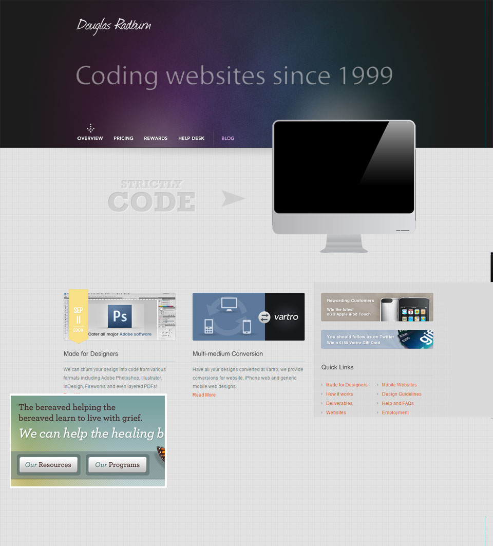
Originally I seemed to be heading down a very ‘agency’ style layout and design but as a personal website I didn’t want to overload it with taglines that are aimed at selling a service. Nor did the Apple screen seem appropriate for Doug; possibly a decision borne from knowing him for a number of years. The idea is to throw in a few in jokes into the design just for my own amusement that won’t distract the user.
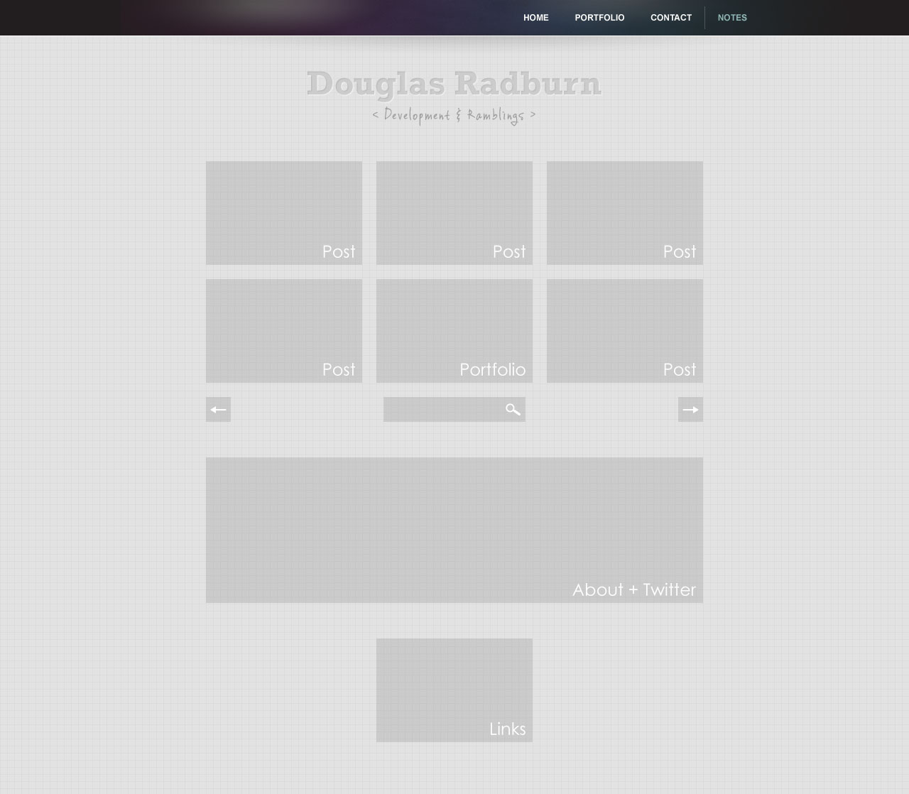
What I have so far
So with the agency look not working I stripped back the big header and aimed to simplify the design. As Doug is infrequent in posting both articles and portfolio items I minimised the space these would take on the homepage, yet kept their prominence as they are still the focus of the website. As these occupy the same space the portfolio items will utilise imagery in these spaces and the posts only the title of the post.
Gone too are the categories and archive, with only three categories and most of these within general it seemed to be underused functionality. With the archives spread over 5 years this seemed like navigation users were rarely likely to use in order to find specific information. The search therefore remains as it is a good way of finding specific archived information.
So far the design shows the intended design of the navigation, header and background as well as placement of all other information. At later stages an RSS link and footer will be introduced but as yet I’m not fixed on what will happen with these.
I know there’s not much there to look at yet but I’m just looking for feedback however small as I’m hoping getting feedback might get me thinking a little differently and improve the final site. As I carry on with the design I’ll post some updates here to keep getting as much feedback as I can.