Designers F**ked up
Careful! This post is looking a little old and could be inaccurate in many, many ways
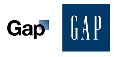
I wasn’t planning on jumping on the bandwagon of hatred for the new GAP logo and thankfully this won’t be another attack on GAP or their designers for what appears to be some rather awful design choices. Instead I’m going to attack other designers for what occurred afterwards.
Opinions
As soon as the new logo was unveiled Twitter was awash with opinions as to how bad the new logo was, with few able to state why in 140 characters. But rather than retreat to their blogs to formulate good and balanced opinions they took to the likes of Dribbble to mock the new logo. This is a growing trend with the new iTunes and Myspace logos have undergone similar mockery.
Freedom of expression is all well and good but did it really help anyone? Did it help the decision makers at GAP understand why the design community felt Laird+Partners had let GAP down with the decisions they had made?
Was it the companies fault?
We could of course place the blame at Laird+Partners’ door for creating something so fowl but as many designers know sometimes the client just wants what it wants and any amount of expert advice will not sway them.
So after first ridiculing the new GAP logo the designers then took it upon themselves to set themselves the challenge of creating what they felt would be the ideal GAP logo; a suitable challenge in how to redesign a global brand. So up sprang a flurry of new, arguably better, GAP logos. What would be the harm it’s not like these would ever replace the GAP logo commercially.
Or so we thought…
What started as a small personal challenges developed into larger competitions with prizes to be won; and now the situation is heading towards the dreaded ‘spec work’. For those not in the know ‘spec work’ is any work done in order to be awarded a job, in small cases this is quotes and reports but for some it goes as far as providing full designs in the hope of being paid. The likes of Crowdspring and 99designs are great examples of this.
But following the extreme reaction GAP have dropped the new GAP logo and returned to the old one. Yet rumours suggest they may look at crowd sourcing their logo as they continue with their wish to rebrand. It’s hard to believe crowd sourcing was ever considered at GAP previously, otherwise they would have used it. Yet with all the new GAP logo’s floating around, created by professional designers, it has led one of the largest global brands to think crowd sourcing its logo may be a viable option.
For this we only have ourselves to blame.