Google Redesigned
Careful! This post is looking a little old and could be inaccurate in many, many ways
Many a designer has mentioned the lack of design in the Google homepage and at FOWD Tour Leeds last week it was fleetingly mentioned again. This time however it lit a spark and I thought it might be a fun experiment to see what I could do.
Just a bit of fun
Of course I’m unlikely to ever get Google to redesign their homepage; greater designers than me have tried. Instead I would just have fun and see what I could do with the most famous web page in the world.
The rules
It’s was the simplicity of the Google homepage in the age of search portals that made it stand out from the crowd. This simplicity should never be messed with but that’s no excuse for what is still a rather under-designed website that has undergone very little change since its creation.
So before the game started I needed to set some rules:
- The logo. This had to remain unchanged, resizing however would be allowed.
- White and Blue. Such strong elements of the Google brand had to remain.
- 2 Submit Buttons, 1 Text Field. Now supposedly patented by Google these had to stay.
- Links. All links visible on the site had to remain, although could be contained within sub menus if required.
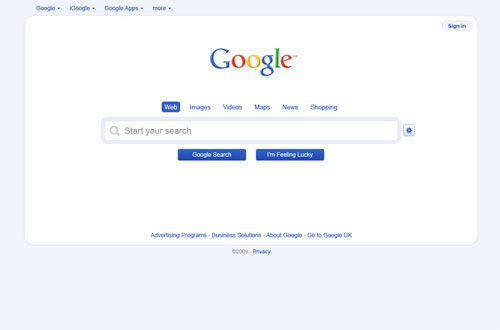
What I came up with
See a larger version on Flickr
Let me explain
Sure it’s not perfect, but it’s a start. The idea was to add some design flourishes to Google so that it remains recognisable and useable to Google’s users but just freshen it up a little. So what has been changed?
Logo
As the rules stated this had to stay the same, but I have reduced it in size a little. Those that use Google will know Google so reinforcing the brand with a large logo isn’t so much of an issue anymore. Instead the Google logo stays prominent on the page with the use of surrounding white space.
Search Box
Google recently increased the font size of form elements. For the search box I increased that even further as it is the primary element of the page so with that I added a text prompt, a spyglass icon and thick border to ensure this is obvious to all users.
Buttons
This was a simple case of utilising an alternative to the default button styles, keeping the buttons positioned similarly to the current homepage so there is consistency for all users. I did however reduce the recent font increase as the increase just made the buttons look broken in the current homepage.
Settings
The search settings link is oddly far away from the search box. The relationship between this link and the search box needed to be made more obvious so this and the links to advanced search and languages would be brought under a settings icon that would display these icons on click.
Fixed Width
On the Google homepage the use of a liquid layout seemed odd as it only places links further away from the main content area on large monitors. Using a fixed with allows for these links to remain within the primary content area as well as allowing the additions of background styling.
Links
The links above the search box were originally positioned in the top left corner. Although still there under drop down menus that better subdivide the Google services these links appear above the search box. This way the user can select the area they wish to search under and still use the main search box without being redirected to the homepage of that particular service. This not only saves time for the user but reduces load on the Google servers by removing unnecessary page views.
What Next?
If I was to take the design another step forward I would want to add more graphical icons to improve usability and accessibility as well as add trending topics to bring Google more in line with Twitter as a resource for up to the minute news. Both these could be counter inducive to the simplicity of the design so would need careful consideration.
So there are my ideas. What would you do with the Google homepage given the chance?