Last.fm new design review
Careful! This post is looking a little old and could be inaccurate in many, many ways

So now a day on Last.fm’s new design is up and running and more stable than it was 24 hrs ago at on launch day. Having had a bit of time to look around the design I’m a little concerned about what’s changed.
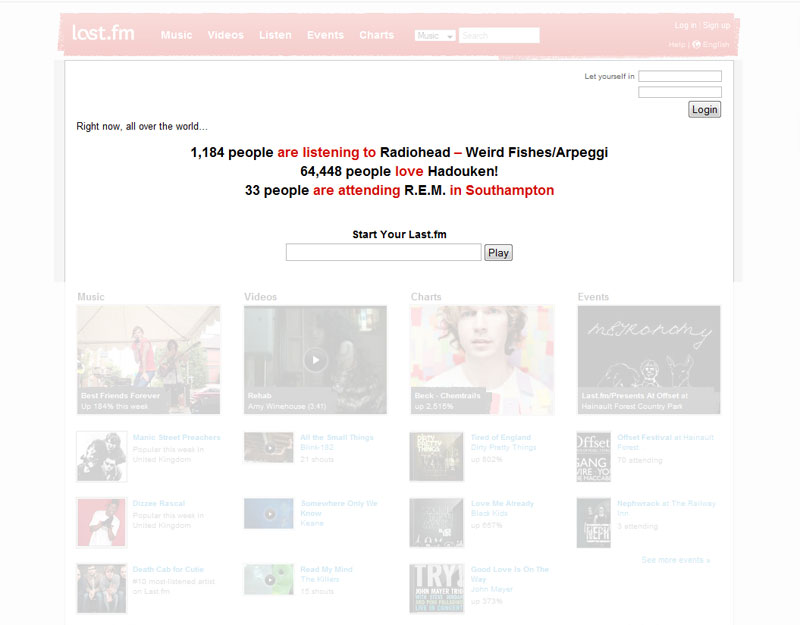
On initial looks I thought Last.fm had retained their distinctive pink/red but on further investigation even this has been tweaked. Luckily this is only a small change as anything more drastic could have made the new design truly unrecognisable from its predecessor which I think would have been a mistake. The new colour is only used sparingly throughout the website with the greatest use being the header background. I like the grungy, sponge paint effect they’ve used however it looks a bit out of place in a site where the rest of the design is so clean.
The internal pages of the website all get the thumbs up, the liquid layout between 800 and 1024 widths works smoothly and the design greatly benefitting from its content as the design around the content is rather simple and uncomplicated. This is where the problems start. As the sites good looks depend on a certain amount of visual interest form it’s content the homepage’s lack of such great a bland and uninviting experience. It’s true that most, if not all, social networking sites has content light homepages however they usually design around this using strong imagery or putting more design into the elements they do have such as search and login areas. The Last.fm homepage makes no attempt at this, in fact I’d go as far as to say that no design work has been done in the whole area below the header and above the images half way down the page (below the fold). I truly feel this page fails on so many levels of what a homepage should be.
On the functionality side of the new design I think it’s pretty much business as usual with the added benefit of a spring clean to organise the site, improve the pre-existing features and better integrate the features added through the lifespan of the previous design. I can understand there being a lack of new features as I understand Last.fm have been heavily involved with the record companies to play royalties for any music played, thus turning Last.fm into a customisable online radio channel. I’m unsure how successful this will be as Myspace are still the dominant force on free online music.
Even with the extensive beta testing the site has undergone with the sites paid subscribers the site still appears unfinished. Not only does the login box on the homepage never seem to actually login, and the favicon seems two iterations too old, but the site appears to have received limited browser testing. When viewing the website in Internet Explorer 7 the site reveals some obvious positioning differences to those in Firefox, I personally feel these issues are fixable and should not be compromised on just because they do not damage the overall layout and usability of the website. Also while looking into the positioning issues I also came across the fact the site is in parts using tables for layout. Seeing such a powerhouse of a website resorting to these methods of design is enough to make me cry.
It might seem like I rather dislike the new site, and although this is true of the sites homepage I actually love the rest of the website, it’s both clean and usable. It just seems astonishing that given the beta testing carried out that the launched websites doesn’t seem more like the finished product it should have been and that would not of received so much criticism.