A New Design: Part 2
Careful! This post is looking a little old and could be inaccurate in many, many ways
Earlier in the week I wrote a post asking for some feedback on a design I was working on. Even though the design was only in the very early stages I got a good reaction as well as some good feedback. Since then I’ve been working on the design and I think It’s time to try and see what people think.
So design number two…
What I’ve Done
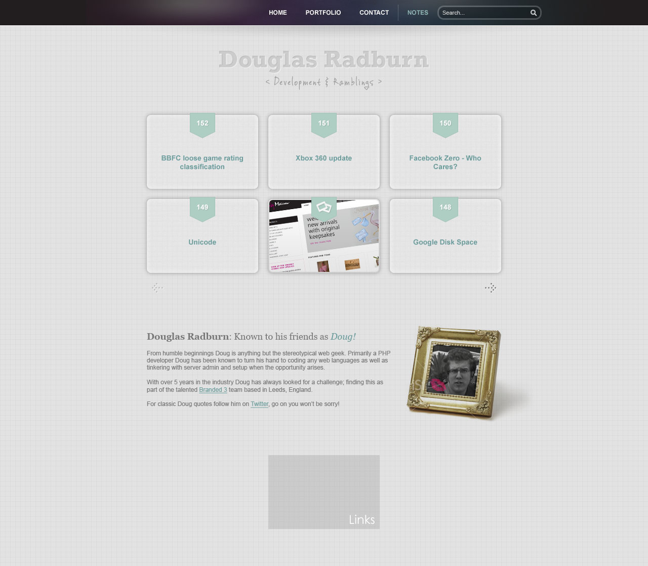
So far I’ve got the posts and about areas of the homepage pretty much finalised. Along the way a couple of things have changed from the original plan:
- Search Box: This has been moved next to the navigation. I was unable to come up with a sympathetic design solution below the posts. Plus as a by product of the move it now means the search box will have a fixed position on all pages.
- Twitter: Although I haven’t made a final decision it’s looking likely that I’ll drop the twitter feed from the website, or least move it from where I had originally planned. Instead I’ll add a floating ‘follow me’ style button on the right that can be positioned on all pages in the site.
Feedback from design one
The feedback I got from the last version was really useful:
- Newest Post: The layout I intended to use could have made knowing which post was the most recent difficult to figure out. To solve this problem the posts have been numbered to provide a clear sequence through them.
- Colour: The wireframe was always going to look a little bland and this version maybe isn’t much better. I always planned a fairly minimal design and with that comes minimal use of colour. Where colour is used it is used to highlight specific elements and provide focus. The plan is also to add more colour when users rollover specific elements.
Help
Again I’m pretty much looking for feedback on anything to do with the design, even if it’s something as small as a pixel that’s out of line. As well as any general feedback there’s a couple of things I can’t quite make my mind up on so I’m going to try and palm the decision off to anyone reading this:
- Does the misalignment of the search box to posts look odd?
- Is the font used for the tagline ‘< Development & Ramblings >‘ a font too many, or just the wrong font?
Thanks for any feedback, and apologies if by the time you get here I’ve tweeted it a few thousand times. 🙂